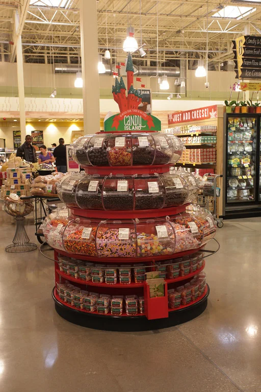
The project goal was to convey the high quality of Whole Foods Market candy, which contains no artificial colors, flavors or sweeteners, while also being playful and attractive to kids. The program was sent to store graphic artists who were tasked with fitting the program to their displays. I provided several different elements including a poster, circular signage to hang from the ceiling and a graphics toolkit with many elements for them to use as they saw fit for their store. One of the best things about this project was seeing how graphic artists interpreted my vision.
The look of the program had to be flexible as it needed to be fitted to different types of displays and containers. Many of the stores received three-tired round fixtures, while others fitted existed displays or received rectangular fixtures with open candy bins. I also created a bag with a PLU for guests to put their candy in. It had to be spot-printed so I had to simplify the original design.
Candy Island has been quite a successful program and has put the southwest region's candy department in second place for highest sales in the entire company.


