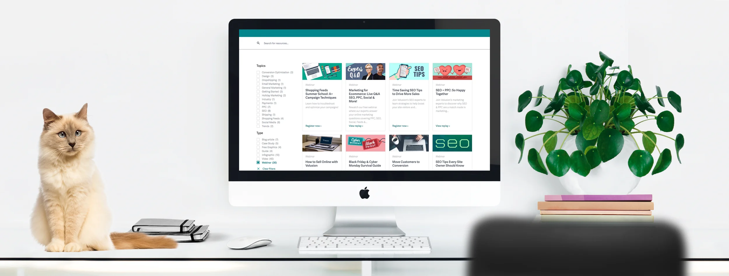
I was so thrilled when I was given the opportunity to redesign these pages. The Resources section was scattered across several ill-designed pages that probably confused users more than it actually helped them. The Experts section used to be on a different server that only an over-worked product team could access and hadn't been updated in a few years. Under the new site map, all learning resources are under one section called the Ecommerce Library and the Apps and Integrations and Experts pages have been reorganized under one tab, though they remain two separate pages.
In the Ecommerce Library, users are able to narrow the parameters of what they see by topic or by resource type (webinar, video, guide, etc.). Some links will take them to articles on the blog but most take them to a cleanly redesigned page where the information is front and center. Even the registration form is treated lightly so it's visible and obvious but doesn't distract from the information.
The same theme is applied to the Merchant Marketplace. Users are able to narrow by category and once they've selected a vendor, they are taken to a cleanly designed page with hopefully easy-to-understand information (varies by vendor) and a simple call to action.


