logo designed by Molly Francis
It had been several years since Volusion received a brand update and I was thrilled to be given the chance to rebrand it. In addition to the color and image updates, the developer team worked solidly for 6 weeks to move the entire site from Drupal to static, which helped dramatically increase load times and SEO ranking.
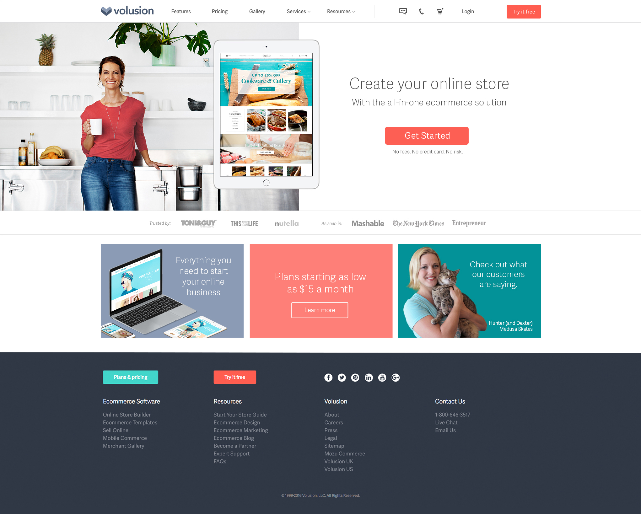
In my view, the change that helped update the brand the most is the new color palette. A cool muted violet called "Fjord" replaced the ubiquitous tech blue as the main brand color and a bright coral replaced harsh orange used for all CTAs. The aqua, teal and sea foam green fill out the rest of the primary palette while a deep blue, golden yellow and deep sky blue fill out the secondary palette. Additionally, several shades and tints of the palette were added to be used throughout the site and became incredibly useful in creating color schemes for promotional ads.
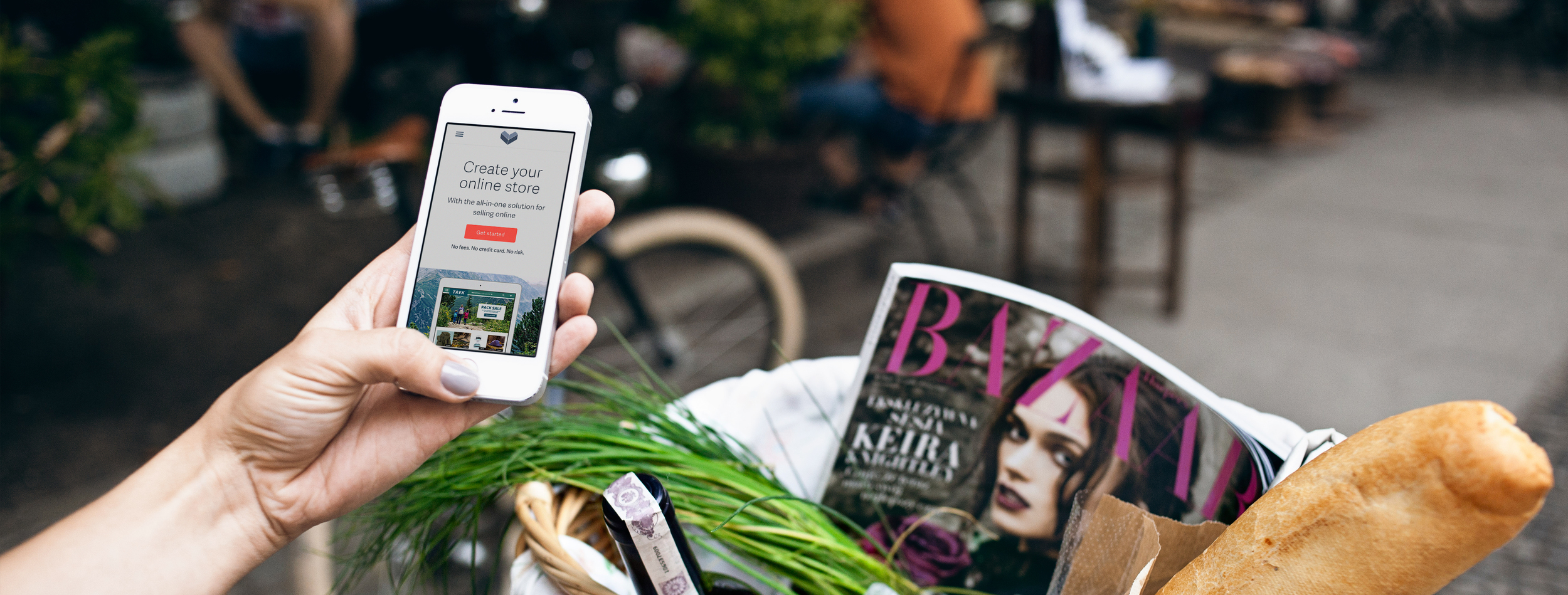
To continue the refresh, the photography styling was also updated. In the old branding, images of people holding devices dominated the site. While useful, that sort of thing can get a little stale if used over and over. Under the rebrand, the images focused on either the customers themselves or echoed the imagery in an available template or custom web design example.
Huge blocks of text that dominated the previous design were removed and more important pieces of information and imagery were given center stage and allowed to breath in generous whitespace.
When considering the layout and content to be included, specifically on the homepage, we ran the old version and newer versions through usertesting.com. We discovered that people really liked seeing customer case studies, especially the one for Medusa Skates. The case study was full of high quality video and photography of the magnetic proprietor, Hunter and her adorable cat, Dexter. Users also reacted positively to the icon-bulleted list of features and heat-mapping showed they tended to linger at spots in the vertical-middle of the page and at the end. So we put free trial CTAs at the top, middle and end of the page.
This rebrand continued to evolve as A/B testing gave further insight into what led to more clicks and conversions. Below is an example of a test that was run between a long homepage with minimal text and a lot of whitespace and a short homepage with just the hero section and three "buckets" below that led to either the Features section, the pricing page or a customer testimonial page. The long form page proved to be a more successful homepage as users tended to prefer scrolling for more information as opposed to just having minimal information "above the fold." The short form page did prove a successful landing page for certain search terms, though.
